THE ART OF HEALING

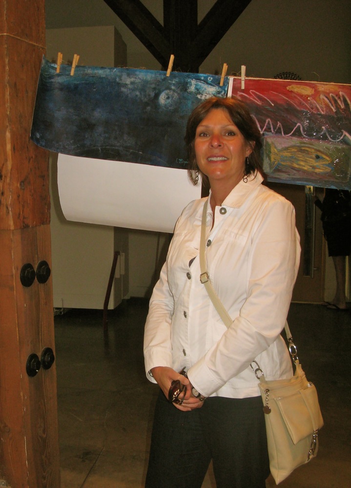
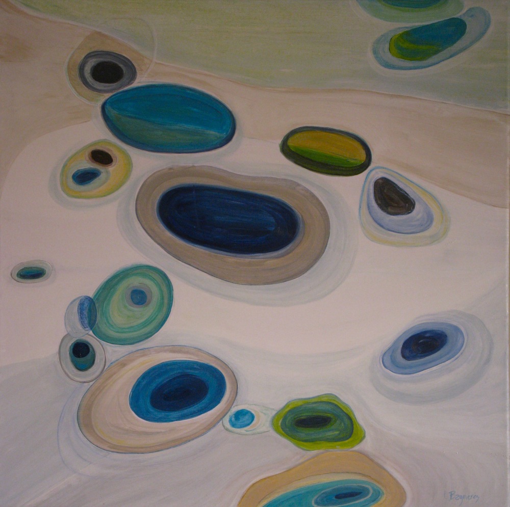
Recently, I made a donation to the St. Paul’s Hospital Foundation here in Vancouver.  Anne, a member of the art committee visited my studio in the springtime and selected one of my mixed media works on paper entitled Berçeau/Cradle”.Image

Last week I was finally able to pay a visit to the hospital where my painting is appropriately displayed in the main corridor of the Maternity Ward located on the 3rd floor of the building. I was happy to find that it fit very nicely into the surroundings and that many proud parents and grandparents will be rocking their babies in front of my symbolic cradle!

Image

Image

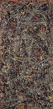
As I walked around the hospital, I couldn’t help but notice the rich and diverse collection of artwork that adorned all of the walls. All of it has been generously donated by collectors and by the artists who created it, many of them well known B.C artists such as Sylvia Tait, Jamie Evrard, Bratsa Bonifacho, and Geoff Rees. Here are just a few of the artworks at St. Paul’s by Sylvia Tait (Concerto for Left Hand), Bratsa Bonifacho, and Geoff Rees (Loose Change).

Image

Image

Image

It’s interesting to find out that studies that have been published in both interior design and medical journals have left no doubt that well chosen and placed art can have great therapeutic value in hospitals and clinics.  Here is what one man said about a recent trip to St. Paul’s while his partner was getting treatment. “I brought my partner into St. Paul’s emergency and while he was being operated on, I walked around the hospital and was immediately drawn in by the fine art collection.  I felt embraced by the works of artists I knew and many I didn’t.  The artwork made me feel much more comfortable and at home in those long hallways, and the day passed quickly.  That day, your (St. Paul’s) art saved my life.”

Doctors and other health care professionals often say that medicine is an art and I truly admire their continued strength and energy into the giving of themselves in order to heal other human beings day in and day out. Undeniably without them, we would be toast!  However I believe that art can be good medicine.  Research has indicated that psychologically appropriate art can substantially affect patient outcomes as blood pressure, anxiety, intake of pain medication and length of hospital stay. So if you’d like to make a gift of art or simply make a donation to support the hospital’s greatest needs, please contact St. Paul’s Hospital Foundation at 604-682-8206 or visit the Foundation at www.helpstpauls.com . My fellow 5enses artists Catherine Fields, Therese Joseph, Mena Martini and Sara Morison have all generously donated a painting to this great cause as well as my artist/friend Heather McAlpine, who in the past year has also donated numerous works on paper to the Foundation.

Lastly, if you happen to drive or walk down Burrard Street at night during the Christmas season put aside some time to take in  St. Paul’s legendary light display appropriately entitled Lights of Hope. If you are a resident of the lower mainland or a visitor to our beautiful city, this is one Vancouver icon you won’t want to miss! Happy Holidays to you and yours! XOXO

Image

Rembrandt & Self-portrait: A lesson in simplicity and humility

I was keen to visit the SAM last weekend in Seattle to check out the Treasures of London’s Kenwood House. Rembrandt, Van Dyck and Gainsborough are just many of a vast array of Flemish and English painters in its collection.  It’s also known as the Iveagh bequest (aka the Guinness family) and 50 of its masterpieces have been loaned to Seattle’s Museum until May 19 2013.

The last Rembrandt painting I saw was in the Frick collection in New York around 2011: a self-portrait he achieved in 1658 when he was about 52 years of age. A year earlier to that date he had been forced to hawk his art collection and later he would lose his home and go bankrupt.  The self-portrait from the Guinness collection and on display in Seattle was a painting he had done in 1665…4 years before his death. It is also known as “Self Portrait with 2 Circles”.

Image

The museum’s doors had just opened so I was able to stand in front of this masterpiece alone, before the other visitors began to trample in.  Immediately I am seduced by the tonal contrasts – Rembrandt’s signature style.  His bold lights and rich darks – a strict palette of earthy tones, burgundies and smoky umbers juxtaposed against the rapid strokes of white he used to depict his painter’s cap leading up to his humble glance – one he had captured before in more than 40 self portraits.  Upon further study I also notice a simple composition…. the triangle that made up the positive space of his body – from his head to his torso and taking up the bottom half of the painting. What I found to be the most intriguing however was what Rembrandt had done with the negative space in behind him. Two half circles had been drawn in, becoming the key elements to his entire composition. As I followed the curve from the top right of the painting I landed into the painter’s palette. The rhythm that Rembrandt created by the fanning of the brushes led me up to his radiant face that he depicted inside the curve of a second circle located in the top left of the composition. This curve then led back again to the second circle…. simple, sublime, and carefully executed by the master…. the composition was perfectly balanced. But I wondered if there was another reason as to why Rembrandt had included these two half circles in this particular self portrait? I went to see if there was another explanation and found the curator’s notes. In this self-portrait, Rembrandt was making a reference to Giotto, another master painter from the 13th century (the frescoes in the Church of San Francesco of Assisi  I visited 10 years ago are definitely something to put on your art bucket list.)  Story has it that upon being summoned by the pope to demonstrate his artistry, Giotto responded by drawing a perfect circle in one single sweeping motion. According to the curator, Rembrandt’s two circles in this self-portrait were drawn in order to symbolize a perfection of his artistic skills.

Rembrandt was someone that experienced the high highs and the low lows of being the genius of the artist he was.  In his time he was considered to be one of the most subliminal innovators of the chiaroscuro technique. Every young painter wanted to apprentice under his wing, every nobleman and woman wanted to have their portrait painted by him.  Mismanagement of his works and collection led him to losing his home.  By the time he had painted this self-portrait, his wife had died, he had gone completely bankrupt, but he continued to paint showing complete humility and his mastering talent.  It’s as if he was trying to tell everyone – “you may take away all my worldly possessions but one thing remains – I can still draw and paint.

By executing these simple yet precise gestures, he still owned it.

On the way out of the SAM, I’m thinking back to one or two “kind of “ self-portraits I had done…. particularly one I had completed 25 years ago during my first year of art school which still sits in my studio today.  It too included a circle.

When this classical theme was given to my class as an assignment for our 1st year photography course my immediate response then was that in the past, artists had typically portrayed their faces in a self-portrait…. seems normal since your face reveals your identity and so the idea of “self” is revealed.  I believed that the idea of self could also be revealed by showing other parts of the body so I decided that I was going to manipulate simple black and white images I had taken randomly of my own body – hands, feet, legs arms, neck torso and so on. I suppose it is also important to mention that at the time I was influenced by the contemporary work of Andy Goldsworthy – like the way he pieced beach stones together in his ephemeral spiral composition of 1985 entitled “Pebbles Broken and Scraped”.

Image

In this one particular composition, I used 3 repeated images I had photographed of my legs that I then puzzled together. By playing with the positive and negative spaces, a simple circle began tracing  itself out to follow a natural continuum….and  so I entitled it “Continuum: Self-Portrait”

Image

Some last thoughts about the Kenwood collection – this is the first time the collection has left European soil so if you can get to Seattle it is worthwhile to see this vast 17th century collection from some very important artists. If you are hoping to see many Rembrandt oil paintings, then you’ll be disappointed, however there are more than 20 of his exquisite etchings on display in a room off to the side of the main gallery.

Back to Rembrandt and his self-portraits…. he remained diligent and true to this subject matter in 4 more self-portraits he achieved before his death in 1669.  I’m glad I got to see this one in person…it was a humbling experience and an important lesson from a grand master!

Kindred Spirits

Two Saturdays ago, I was able to visit The 16th Annual Eastside Cultural Crawl, under a grim Vancouver sky. The weekend-long visual arts phenomenon takes place predominately in the east part of the city where the public can take a sneak peak inside hundreds of multiple-disciplinary artists and artisans studios. I commend all the talented artists for allowing thousands of visitors every year, to trench through their sacred creative spaces. Simply amazing!

East-side-culture-crawl-2012

As I started making my way down from the 4th floor to the main level of studios in 1000 Parker Street, with my artist/friend Lynne Green, and across the street to the adjacent building known as The Mergatroid building – I immediately began to connect to a certain number of artists whose visual stories, imagery and subject matter was akin to mine on many levels.

In the Mergatroid Building I stumbled upon Jacqueline Robins’ stunning ceramics, and, a series she entitles Home Sweet Home, immediately caught my eye. Besides the beautiful craftsmanship of a vast array of vessels she hones, her imagery of crows resonated long after in my mind.

Platter_vaneast_jacqueline

VanEast – platter by Jacqueline Robins

 I’ve asked her to give me some insight as to why she chooses to work with “crows” illustrated with impact, on the white clay background of her ceramics. Here is her response: “For me, my Home Sweet Home line is a visual record of my route to and from my studio, crows included. They catch my attention because they are badass, irreverent and non-majestic. As with power lines, warehouses and train tracks, crows do not pretend to be anything they are not. Gritty is beautiful!” 

Wonderfully put Jacqueline!

Next artist on my Crawl list is Arleigh Wood.

City-dwelling-4x4_arleigh

City Dweller by Arleigh Wood – 4×4 – mixed media 

 Arleigh’s studio is located inside the infamous warehouse known as 1000 Parker Street on the 3rd floor suite 326. 1000 Parker Street houses hundreds of artists’ studios. For anyone lucky enough to have a studio space inside this building, it must be inspiring. Besides using images of crows and including archetypal shapes such as circles in the representation of urban landscapes, Arleigh and I share the common bond of showing our work in a few galleries, one in Oakville Ontario known as In2art and The Art Room, formerly of West Vancouver. I am especially drawn to  Arleigh’s beautiful mixed media work entitled the  Migration Series. I asked Arleigh to reflect a bit upon why she uses crows in this particular body of work – made with a combination of photography, encaustic (painting with wax), oil paint and etching on wood panel.

This is Arleigh’s repsonse: “This series was inspired by the daily commute made by thousands of crows in Vancouver. Reminding us of our part in the cycle of life, changing seasons and urban expansion”. Arleigh’s ethereal images are not depictions of the past or the future but exist somewhere in between, floating in memory and dreams. Interestingly enough, Arleigh and Jacqueline are both using images from their daily commute to and from their studios, which are located across the street from each other.

Jennifer Conway at Raven’s Rest Studio is another mixed media artist employing images of crows into various paraphernalia – jewelry charms, magnets, greeting cards, prints and paintings. Although she was not part of the Crawll last Saturday I previously had met Jennifer at several openings at Bird on a Wire Creations. We also show our artwork in there and have had Private Views and have both been featured as “ Artists” in the Window” on occasion. What I love about Jennifer’s work is her conjuring of nostalgia while she juxtaposes her crow images on carefully selected recycled objects (like domino’s, scrabble letters and Rummikub tiles, and bottle caps).  

Jennifer_conway

Jennifer Conway – mixed media

Here’s what Jennifer had to say about including crows as a main image in her work :

“I was born and raised in East Vancouver, and I guess crows are just a part of me.  I didn’t think anything of it, until I did my craft show in Edmonton, and everyone was asking me “what’s up with all the crows?”  In Vancouver, my crow creations are very popular, but in Edmonton they viewed the crows as sad and lonely and preferred not to wear the crows!”

 Why did she decide on Raven’s Rest for her studio name?

“ A few years ago, a local culture crawl artist was having a “name my studio” contest.  The winner would win one of her beautiful pieces of art.  She has a rustic little wooden garage-turned studio space behind her house in the alleyway, and I came up with the name: “Raven’s Rest Studio”.  I quickly realized that I would be upset if I won her contest, because then she’d have the name that I liked so much…so I didn’t enter the contest after all!” 

That’s a great name Jennifer!

Last but not least comes my own intrigue with our Urban Cousins .

I started including crows in my paintings a few years ago, around the same time, as I was teaching art part-time in the high school located in my neighbourhood. One day, my grade 9 students and I wandered outside to take images of crows for my demonstration of the technique known as photo-transfer.  Typically, these black beauties hangout in masses in the branches of the majestic trees surrounding the school property.

As I continued observing and photographing them and incorporating thier images into my compositions, my fascination with their intelligence, social networking skills and their cheeky attitudes, became prevalent. I also like the way their black silhouettes emphatically  make a punctuation mark on my canvases and how well their curvilinear shapes mesh so well into abstracted patchworks of colour, and collaged bits of paper.

Theories_of_integration_i_-_2012_-_10x10_copy

From the triptych –  “Theories of Integration I” ( left panel) – 2012 – 10×10 – Mixed Media 

I suppose this species of birds are like us in a way, adapting and evolving alongside our ever-changing urban environment and I realize there is so much misunderstanding surrounding these creatures, as I get feedback about my own artwork. Even their flocks have been labeled ,“ A Murder of Crows”. Nevertheless, the West Coast Native People link them to creation and in their beliefs, the Raven is known as the “bringer of light”.

Love them or you hate them, either way, these kindred spirits, are here to stay! 


Papermoons at “Papergirl Vancouver 2012”

A very cool event is taking place this week from July 22- 27th at the Roundhouse Community Arts Centre in Vancouver.  It is part of an amazing global art movement that began 5 years ago in Berlin, but now has moved into cities like New York, San Francisco, Portland, Glasgow & Istanbul (just to name a few.)

It’s called “ Papergirl Vancouver” and one of my fellow artists and friends Sara Morison from the 5enses, and I have donated some of our original artwork for this event. Sara participated last year and encouraged me to join the movement!

Img_4621

The idea behind the Papergirl project is to combine Philanthropy + Bikes + Art + Public.  Artwork produced with any media on paper is donated by local and global artists and will be distributed by volunteers on bikes to random members of our community.

Img_4614

Here are two of my  “Papermoons” that will be given out to someone somewhere in Vancouver this Saturday afternoon July 27th.

Img_4340

“Moon Pool” – Mixed Media on paper – 16×36 – 2012

Img_4344

“And the Whale jumped over the Moon” – Mixed Media on paper – 12×36 – 2012

The opening for “Papergirl Vancouver” was held last night and it was fun to see over 700 works of art displayed mostly with clothespins over lines strung everywhere around the Roundhouse’s main gallery.  Some 136 artists have donated one or more pieces of artwork and the best part about this non-commercial art project is that it encourages artists of all ages and abilities to participate.

Img_4617
Img_4630
Img_4619

Img_4618

Sara Morison – fellow 5enses artist in front of one of her donated mixed media works entitled ” Waiting for Summer” 

Img_4629

Lastly, anyone can become a papergirl….. Guys, girls, ladies, gents, amateurs, emerging artists and pros. Everyone is welcome to give his or her artwork to this fabulous community event.

So if you are somewhere around False Creek, or the any Vancouver’s seawalls this Saturday…. maybe you’ll be the lucky recepient of some of this artwork?…randomly selected of course, by a papergirl on a bike!

This definitely epitomizes the meaning of “Street Art” and takes it to another level!

Img_4625

“Paper Girl Vancouver” – the Art of giving Art – a great week-long community event!      

Paper-moons at Paper-girl Vancouver 2012

0 false 18 pt 18 pt 0 0 false false false

A very cool event is taking place this week from July 22- 27th at the Roundhouse Community Arts Centre in Vancouver.  It is part of an amazing global art movement that began 5 years ago in Berlin, but now has moved into cities like New York, San Francisco, Portland, Glasgow & Istanbul (just to name a few.)

It’s called “ Papergirl Vancouver” and one of my fellow artists and friends from the 5enses, Sara Morison and I have donated some of our original artwork this year!


Land Art : Holey Waters

A recent trip that brought me and my family to the beautiful Okanagan region of B.C. (Osoyoos – to be exact) got me thinking about the parallel between art and nature.  We came upon this strange psychedelic looking phenomenon known as the “Spotted Lake” (aka Ki’lil’xw in the Syilx First Nations Language) as we were driving along Hwy 3 back to Vancouver. 

This lake has long been regarded as a spiritual site by those who attribute therapeutic powers to its rainbow coloured pools.  Apparently it contains an unusually high concentration of calcium, sodium, magnesium sulphates and other minerals and as the water evaporates in the summer, these sulphates then crystallize and form circles in hues that change daily. (I took this picture at the end of the morning but if you go online you can see photos of the Spotted Lake showing quite an array of colours.)

Spotted_lake

“Spotted Lake” near Osoyoos B.C.

As I stood before this awesome spectacle – I couldn’t help realize the uncanny resemblance between this holey sea and my current paintings, which are about observations made on a recent hike along Lighthouse Park and the tide pools I found there.

Img_3933

Ebb&Flow:Pacific Tide Pools I  – 48×48 – Acrylic/Mixed Media on paper – 2012

Img_4145

Ebb&Flow:Pacific Tide Pools III 36×36- Acrylic/ Mixed Media on paper mounted on canvas 

( Available at Tartooful, Edgemont Village, North Vancouver)

Img_4158

Ebb&Flow: Pacific Tide Pools IV 24×24 – Acrylic/Mixed Media on paper mounted on canvas

(Available at Tartooful, Edgemont Village, North Vancouver)

This is my abstracted response back in the studio about experiences derived from watching and thinking about the constant ebb and flow of the seawater and the elliptical accumulations made along the shoreline of the Pacific Coast. 

Archetypal shapes like ovals, circles and spirals created in nature have long fascinated humans and artists. Land Art or Earth Art and its artists (an art movement coined by Robert Smithson in the 70’s) have attempted to incorporate these shapes into the earth’s vast landscapes. It is an art form that is created in nature, using natural materials such as soil, rock, boulders, stones, organic media such as logs, branches and leaves and water with introduced materials like concrete, metal, and mineral pigments.  Sculptures are not placed in the landscape; rather, the landscape is the means of their creation.

One of my favourite pieces and best examples of Land Art sculpture is The Spiral Jetty (below) done in 1970 by Robert Smithson.

Robertsmithson-spiral-jetty-great-salt-lake-02-1970

I have yet to see it personally but The Spiral Jetty has drawn art-lovers out to the northeastern shore of the Great Salt Lake for decades.  Extending out into the Lake, exposure to the elements has changed the Spiral Jetty significantly since its creation in 1970, which is more reason to visit it sooner rather than later.

Another piece entitled “Painted Stones on a Beach” and created in the spirit of Land Art was done by Japanese artist Shiro Hayami.

Japarhayama_shiro_hayami_land_art_painted_stones_on_a_beach

The placement of the contrasting boulders,aligned one by one along the shore, naturally draws the viewer into the sea and a “Zen-like” Utopia. The purity and simplicity of this 3-D installation echoes the orb-like pockets naturally created by the water and minerals I witnessed a few days ago near the naturally awesome  “Spotted Lake” outside of Osoyoos. Indeed here, the landscape is the creation, just waiting to charm and delight a lucky passerby!

Matisse: Master & Mentor

I visited the VAG today, to see and witness for myself, what the hype and attention behind the exhibition “Collecting Matisse and the Modern Masters”  was all about. It’s on loan to Vancouver for the whole summer from the Baltimore Museum of Art (collected by The Cone Sisters)…and I was pleasantly surprised!

Claribel and Etta were two avant-garde sisters who made a point of purchasing contemporary paintings and other works of art from what are now known as the “modern masters” (Cezanne, Picasso, Matisse to name a few). They even visited the studios of Picasso and Matisse in France at the brink of the Cubism and Fauvism movements.  Over all, their collection is comprised of more than 300 sketches, lithographs, paintings and bronzes of just Matisse alone…just outstanding!

The VAG does a fantastic job of explaining The Cone Sisters relationship and friendship with the artist using multiple displays throughout the gallery space. Matisse’s large nudes, towards the end of the gallery,are not too be missed.

My favourites were Standing Odalisque Reflected in Mirror,

Standing-odalisque-reflected-in-a-mirror-1923

Seated Odalisque, Left Knee Bent, Ornamental Background and  Checkerboard

Seated_odalisque_

and the unforgettable Large Reclining Nude with Blue Checkerboard.

Large_reclining_nude

Alongside this composition, the curators explain just how Matisse came to his final painting – 22 photos depicting its different stages in progress – photos that Matisse had taken himself.  It was interesting to see for me as an artist that even the masters get stuck and struggle with composition in order to “get it right”.

I have always admired Matisse’s work… his ability to remain true to himself with subject matter and especially the riot of colour and motifs in his compositions. Every visitor to this exhibition will relish his oils and bronzes however I still appreciate that the curators didn’t hesitate to show Matisse’s charcoal sketches and preliminary drawings in preparation of his masterpieces.  This charcoal entitled “Nu coucher de dos (Reclining nude back view – 1944) shows Matisse’s gift for strong lines and movement.

Matisse_nude-backview

Seeing this takes me back to some of my early days at L’ecole des Beaux Arts in France – my first year in fact – when our drawing and painting professor Marc Borjon, hired a women to pose and dance for our class. The session lasted all day and endless sheets of paper were dispenseed. Here is an example of her five quick poses (5-15 seconds) I was able to capture…

Img_4040

A few years ago, during one of the workshops I had taken with artist Nurieh Mozafarri,  I was able to elaborate on one of these poses with her help…..the sketch depicted on the top left hand corner  of the composition resulted in the figure in the  painting I entitled “ Slumber and Breeze”. Completed on a 16×16 canvas with acrylics and mixed media, it is one of the few figures I have in my repertoire of paintings.

Img_4045

Seeing the VAG’s exhibition today inspires me to get back to sketching and painting the human figure – and Matisse will always remain a great master and mentor to me ….I encourage all of you to visit this beautiful exhibition featuring more than 45 pieces collected by the Cone Sisters of Baltimore – on now until September 30, 2012.

You definitely won’t be disappointed!

The 5’s

Five – 5: the number of fingers that make up the hand.“Give me 5” is an idiom used in the English language meaning slap or shake my hand.  Here is how the number 5  has evolved from a primal scribble into our modern glyph.

Evolution5glyph

Growing up in the 60’s I distinctly remember my first whiff of Chanel No. 5 the first perfume launched by Parisian couturiere Coco Chanel. The French government reports that a bottle of Chanel No. 5 is sold every thirty seconds and generates sales of $100 million a year. It is often considered the world’s most famous perfume. 

Chanel_no_5

This is Andy Warhol’s Pop Art rendition of the infamous perfume bottle – now considered an icon in the art and fashion world.

 I also remember growing up listening to the cool sounds of Dave Brubeck’s Quartet and his “Take 5 piece……

Take5

The album cover is an abstract composition itself painted by Neil Fujita and it

reminds me of Robert and Sonia Delaunay’s modernist yet colourful cubist style.

 and  who can’t forget  the even more famous sound of the  Motown band The Jackson 5 (also spelled The Jackson Five, or The Jackson 5ive), later known as The Jacksons and then in the 70’s and 80’s Michael Jackson turned into the famous teen idol and giant pop star.   

Hopping along from the musical Jackson 5 to another Jackson and his famous abstract painting known as No. 5, 1948 … It was a composition Jackson Pollock executed on an 8′ × 4′ sheet of fiberboard with thick amounts of brown and yellow house paint drizzled on top of it, forming a nest-like appearance. According to a report in The New York Times the painting was sold in 2006 during a private sale for a record price of $140 million. There has been much controversy throughout decades involving Pollock’s abstract art and some may even ask “Is this art at all?” – but remember this: A treasure for some may be trash to another and if my viewpoints of beauty don’t connect to yours that’s all right – so take it easy!

Jackson_pollack_no_5

No.5 1948 – Jackson Pollock – American- Abstract Expressionist

I recently came across an article in the GalleriesWest art magazine about a painter named John Koerner from Vancouver. He is 97 and is still going strong with his abstract painting – you gotta love it!  Here is Koerner’s painting named The Fives done in 1988.

The_fives

The 5’s – John Koerner – Acrylic on Paper – 1988

Like Pollock’s painting No.5, I appreciate it’s subtle, muted colours and the way the rhythmic shapes lead to the repeated 5’s found in the lower right hand corner of it’s composition. I’m sure his gumption for art has attributed to his longevity!

…So why all the 5’s??? 

Five is an important number in my life right now as I am part of a group of 5 women painters called the 5enses. In choosing our name we decided to fuse the number in with the idea of five senses.  The letter “S” in senses mutated into a number “5”, giving our logo a simple yet distinct style.

The members of our group are Catherine Fields and Therese Joseph, both born in Switzerland, Mena Martini born in Italy and Sara Morison and I were born in Central/Eastern Canada.  Although we come from diverse cultures, we all live on the North Shore of Vancouver now, and we share a one common bond for abstract art. We came together during a course on abstract painting given by the Iranian born painter Nurieh Mozafarri in the beginning of 2008.  Presently, we meet about once a week to critique and support one another’s work and we have also had numerous exhibitions together throughout the past four years.

The month of January has been a very busy time for me and the other members of the 5enses group and 2012 has started off with a bang!  Linda Bachman at The Portico Gallery represents all 5 of us in Squamish and has just had a change around a few weeks ago in her gallery, so be sure to check out some of our new paintings if you are passing through to Whistler sometime soon this winter.

We would also like to invite you to view our exhibitions at 2 very unique venues on the North Shore.  If you are catching a performance at the Centennial Theatre we have our large paintings hanging in the lobby there until June 2012. Also, everyone is welcome to attend our opening this coming Thursday night Feb 9th at Delany’s Coffee House in Dundarave Village, West Vancouver for an evening of wine and chocolate in honour of Cupid…. and  of course, for the love and appreciation of Art.

5enses_poster_delanys

Affordable – Original Art…..’Tis the Season

One of my favourite galleries, Cityscape Gallery, in the lower Lonsdale area had their Annual Anonymous Show Opening last night! There were over 700 paintings on display – with 400 art-lovers making an appearance by 8:30 – how wonderful!?  100 paintings were sold in the 1st hour alone- with all the pieces priced at a very affordable $100 each. This is a huge fundraiser for The North Shore Arts Council with 50% staying there and 50% going to participating artists. The show is on until the 23rd of December so make sure you drop by the Gallery to check out all the styles painted in various media!

E-vite_t_aas_nvcac_2011

Here are the some of the colourful walls I was able to capture before the buying folly occurred! Just a spectacular site!! Sorry – can’t tell which are mine….It’s Anonymous 😉

Img_1933


Img_1937

Another show you can catch on until December 16th at Place des Arts in Coquitlam is “Positively Petite”  – Here, all the paintings are small – very small! In fact I didn’t realise I could paint this small!(The size requirement for this show is that all the 2D pieces need to be 12” squared or less)

Pda_positivelypetite2011_poster

These are my 3×4 mixed media paintings done on cradle panel  – entitled “Les Petits Nids de Paris”.

Img_1886

For all my friends and family in Ontario – please visit the In2(little)art Show at the In2art Gallery – located downtown Oakville on Church Street.  All the Original Artwork here is $250 or less. Check out their website to view some of my paintings from the Nest series represented there! (or even better drop by if you are in the area!)

The NSAG is having their Annual Fine Arts Sale on Dec 4th at Parkgate Community Center in North Vancouver.  This show requires quite a large venue since there will be over 800 paintings on exhibition and for sale.  This is a one-day-only event!

E-vite_afas

Lastly my “Moonstruck” exhibition showing some of my abstract landscapes, is still on at the 4th Wall Gallery/Presentation House Theatre Gallery until the end of this weekend in conjunction with Hannah Moscovitch’s award winning “Russian Play” and “Mexico City” – I especially appreciated the rivetting performance given by the actress who played the role of “Sonya”…..

‘Tis the season of giving – Why not give original art to your loved ones this Christmas and support your local artists?


The Colours of Halloween

 I know all of you must be getting into the Halloween spirit right about now, preparing your home for those little ghosts, zombies and witches when they appear at your front door tonight  ………and you’re probably too busy to read this post ……anyway I decided to write about how my colour palette was influenced by the colours of this imminent festivity. These are the colours associated with the warm hues of the harvest contrasted against dramatic shades of black, blue-gray and brown – very appropriate for this time of year. 


Img_1706


Silver Moon – 12×24 – Mixed Media – 2011- (Sold at Bird on a Wire, Vancouver B.C.)

Silver Moon -painted in washes of Carbon Black, Raw Umber, Payne’s Gray, Burnt Orange, Raw Sienna, Indian Red and -if you can pronounce this one correctly- Quinacridone Nickel Azo Gold- my new favourite! A touch of silver leaf in the Moon and the addition of the solitary crow perched high on the crooked branch evoke just enough mystery to this ethereal, semi- abstract landscape. My final layer on this painting is the addition of acrylic encaustic , a totally different animal than beeswax – however -you can achieve  beautiful transparent and translucent drippy layers that simulate the seductive quality of encaustic without the fumes!

Speaking of “mystery and seduction”, as I was driving home the other night, “Witchy Woman” came on the radio, a song by the Eagles I hadn’t heard in a while….It’s a great song that really sets the mood for Halloween and that’s probably what the DJ was trying to do! Strangely enough, I find that these chilling lyrics relate well to my painting Silver Moon… 

Witchy Woman

Raven hair

and ruby lips

Sparks fly from her fingertips

Echoed voices

in the night

She’s a restless spirit

on an endless flight

Wooo hooo witchy woman

See how high she flies

Woo hoo witchy woman

She got the moon in her eye


 …..I suppose we’ve all met someone like this somewhere down the line…. mysterious…. mystifying…maybe even downright spooky?! 

 Happy and safe Halloween to all!

P.S.… watch out for  those witchy women tonight!